While many of us are now familiar with the famous rainbow flag, there are also other LGBQT+ flags that each represent the different sex, sexuality, attraction, and gender diversities within our fabulous community.
Even if most queer people identify with the rainbow flag itself, many also desire to fly their own particular flag alongside it. Because, y’all, representation is crucial!
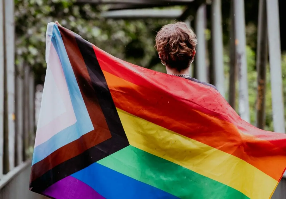
One such flag is the LGBT Progress Pride Flag – a flag you might already have seen flown at an increasing number of pride festivals around the world, from Sitges to Mexico City…and everywhere in between!
For the last 40+ years, the iconic LGBT Pride flag produced by Gilbert Baker’ with its six distinguished colors (red, orange, yellow, green, blue, and violet) has been the globally recognized symbol of the LGBT community.
But in the past few years, Pride festivals, companies, and activists worldwide have concurrently and without any coordination been embracing ‘The Progress Flag’ as their emblem for the queer community instead.
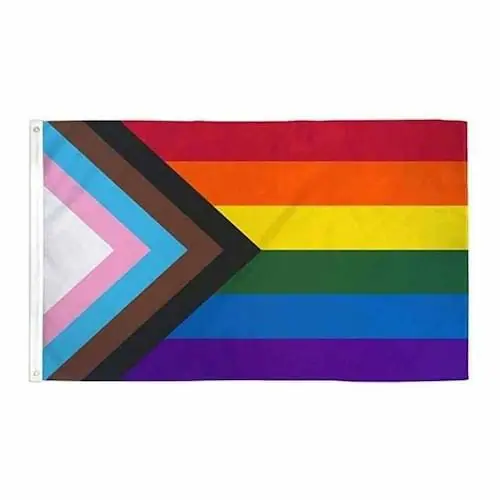
Created by Daniel Quasar in 2018, the Pride Progress Flag features black and brown stripes to portray marginalized LGBTQ+ communities of color and baby blue, pink and white to incorporate the trans flag in its design.
Daniel displaced the trans flag stripes and marginalized community stripes to the flag’s hoist, where they form a new arrow shape. The arrow leads to the right to confer forward movement while purposely being along the left edge, pointing to the fact that much progress still needs to be made.
From the London Mayor’s office to Fort Lauderdale Pride and various cultural institutions worldwide–the symbol being used to serve LGBT people is evolving. And it’s all part of a journey to be more inclusive of the expansive breadth of identities within our community.
The intention behind this change is not to replace or erase what the Pride flag was, but rather to recognize the value of all parts of our modern queer community, which the Progress flag does a better job of.
And considering the current Black Lives Matter movement and specifically the focus on issues faced by queer trans people of color (QTPOC) with our community – this shift towards the use of the more inclusive Pride Progress symbol is one should all fully support and encourage.
Hopefully, in doing so, we can start or continue a conversation not only about trans and POC representation within our community–but about bisexual, pansexual, and asexual people. And the progress that is still to come for the fabulous expanse of gender identities, romantic and sexual orientations we don’t talk about enough yet.
The significance behind the Pride Progresses flag’s design is an excellent encapsulation of where the LGBT community stands. We are a community that has, and is, making exceptional progress. And yet, we still have so much more to do!
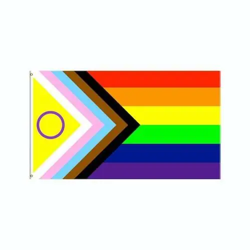
And since pride flags are ever-evolving.. we now have the LGBT Progress Pride (Intersex- Inclusive) Flag.
The ever-changing Pride symbol has been revised again, and in 2021 designed by Daniel Quasar was updated to be even more inclusive – specifically of the intersex community.
The latest version was created by intersex journalist and media figure Valentino Vecchietti. Intersex Equality Rights UK, an advocacy group, unveiled the flag in late May of 2021, and it has since gone viral on social media.
In Vecchietti’s version, a purple circle overlaid over a yellow triangle has been added to the chevron on the left side of Quasar’s design, a nod to Australian Morgan Carpenter’s famous 2013 intersex flag.


